For this project I had to design a feature article for a magazine. I chose to take an article from POB Magazine online and transform it to where it would be in their publication. POB (Point of Beginning) is one of the most well known surveying publications out there. It is devoted to showcasing new and improved surveying technology and techniques.
I chose to do the article " Drones Earn Their Place in Surveying", which was written by Robert Galvin of POB Online.
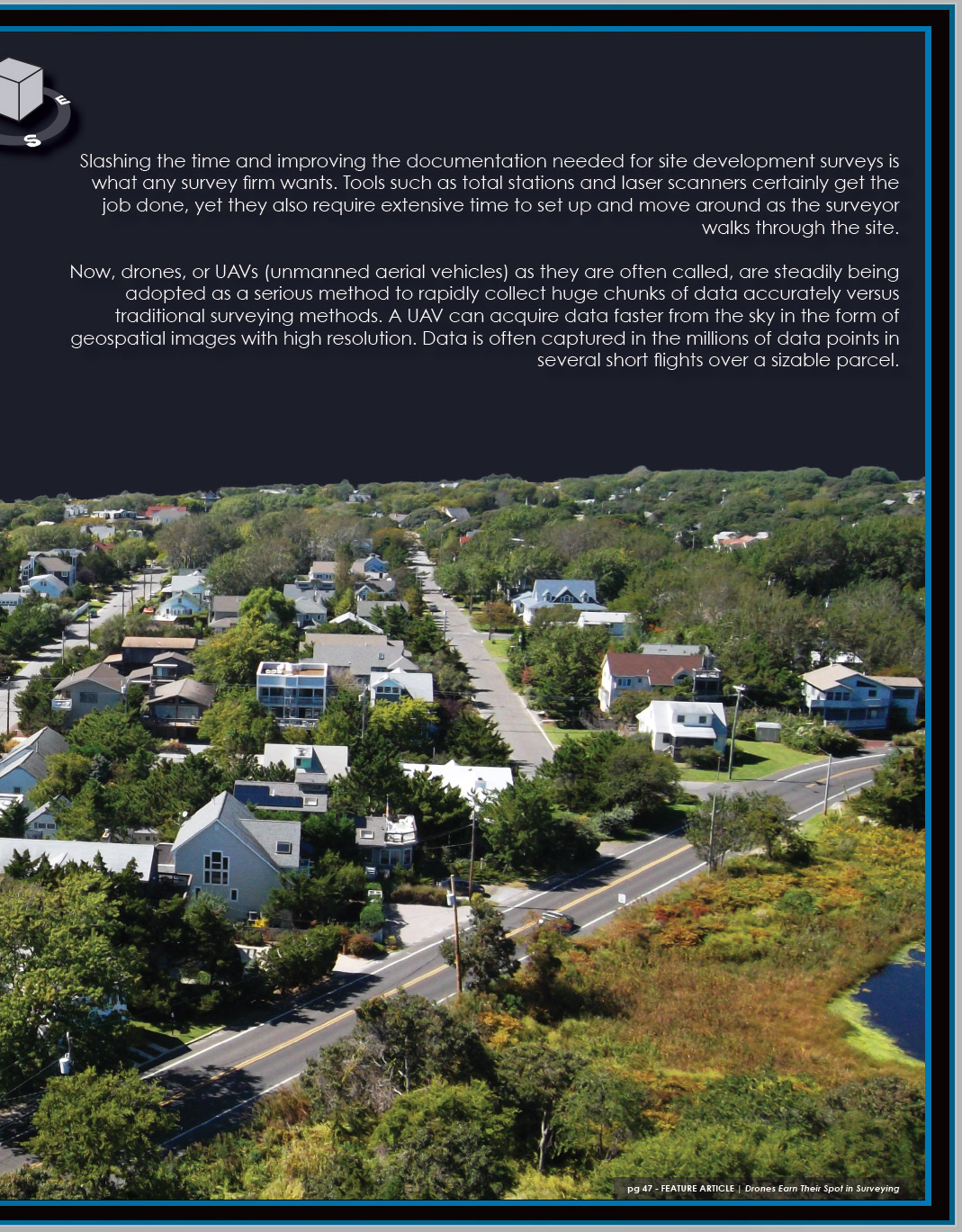
I initially started with a stock photo from www.morguefile.com. I have found this to be a great website for stock photos. I searched for an aerial photo that could be modified to look like it was in CAD (Computer Aided Design), which is a program used for mapping, surveying, and architecture.
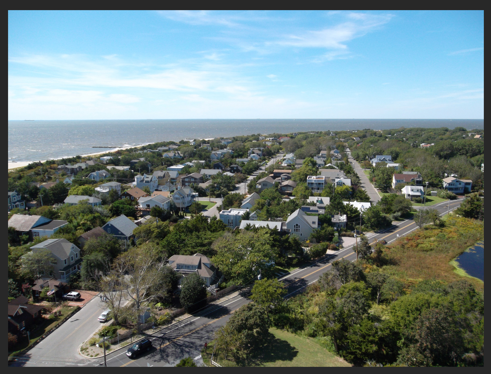
First I added a curves adjustment layer to bring out more of the color in the photo. I also masked out the ocean.


Next I brought the photo into InDesign. I wanted to use this photo for the entire spread. I also wanted to use the curve of the oceanside to help accentuate my text. I chose to use Hevetica for the headline and Century Gothic for the main text. I feel like these fonts compliment each other and even though they are similar, they are quite different.
Page 1
I wanted the title to get smaller as it is read. My theory behind this is that it would carry the viewer's eyes downward towards the scenary, which would carry their eyes to the text on the next page.

Page 2
Page 3
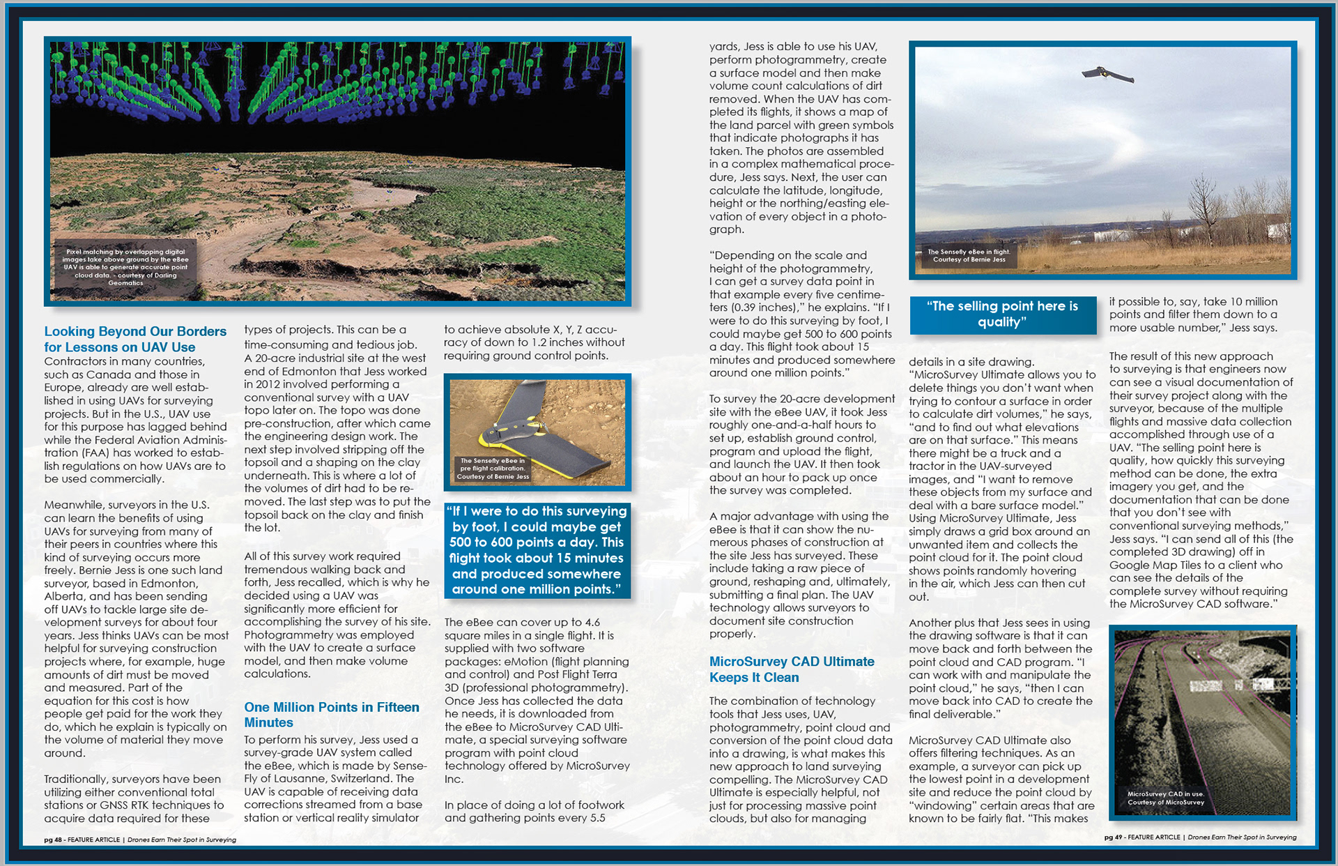
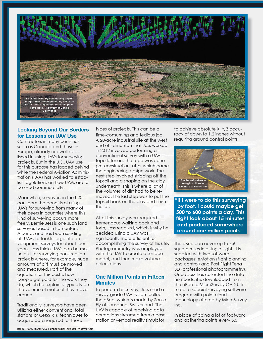
I chose to use a three column grid. I feel like POB is more of a traditional publication, which is why I decided I wanted this article to look like a typical magazine story. I used the grid to position my photographs, which were taken from the article online.
Page 4

Feature Spread

The Article